Understanding the best fonts for healthcare marketing
When it comes to wellness and healthcare, every element of our communication strategy plays a role in connecting with our audience. Among these elements, typography stands out as a pivotal yet often overlooked aspect. This blog aims to shed light on the strategic use of fonts in healthcare and wellness marketing.
The significance of font in healthcare marketing
For healthcare marketing, choose your fonts with purpose.
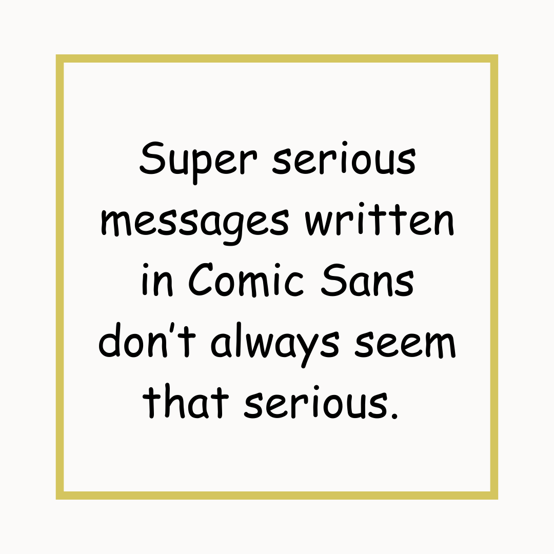
Ever wandered onto a website you expected to convey a certain seriousness only to find the headers are written in comic sans? I definitely have, and it throws me, wondering, “does this person just like comic sans, or is this a deeper signal that maybe they aren’t the authority I hoped?” Now while most of us don’t consciously think like this, our subconscious might.
In other words, fonts matter.
The fonts we choose in healthcare marketing can make or break our brand’s aesthetics, and perhaps more importantly, embody our message's tone and intent. Typically, the best fonts for healthcare should offer clarity, evoke trust, and align with the compassionate nature of the sector. This is particularly crucial when creating materials for any kind of healing websites, where the choice of font can significantly influence the perception of care and professionalism. We haven’t written comprehensive blog posts about all kinds of health & wellness sites, but we did recently publish one for massage therapists if you’d like to give it a read! “Building an effective website for your massage therapy business: a step-by-step guide.”
Categories of fonts and their implications
Healthcare marketing demands a careful selection of fonts that cater to a diverse audience. Fonts for healthcare need to be universally readable, yet reflective of the brand's ethos.
When thinking about fonts, the first branch on the decision tree ends to be: “to serif, or not to serif?” What’s a serif, you might ask? A serif is a small decorative line or embellishment added to the basic form of a character in a typeface. These serifs appear at the ends of the strokes that make up letters and symbols. The presence of serifs is what distinguishes serif fonts from sans-serif fonts, which do not have these additional flourishes.
Embracing tradition and trust with the right serif fonts in healthcare communications.
Serif fonts: Traditional yet trustworthy
Serif fonts, known for their decorative strokes, can impart a sense of tradition and reliability - a comforting aspect in healthcare communications. Here are a few popular examples of serif fonts:
Times New Roman: A classic and ubiquitous font known for its readability, often used in newspapers and academic writing.
Garamond: A favorite for its elegant and timeless appearance, ideal for books and lengthy texts.
Baskerville: Known for its professional and serious tone, Baskerville is often used in more formal contexts.
Georgia: Designed specifically for digital readability, making it a popular choice for online content.
Choosing sans-serif fonts: Modernity and accessibility in digital healthcare marketing.
Sans-serif fonts: Modern and accessible
These fonts are a staple for digital platforms, thanks to their clean and modern look. They are also among the best fonts for therapy websites, offering legibility and a contemporary feel. Here are a few popular examples of sans-serif fonts:
Helvetica: Renowned for its clean, modern lines, Helvetica is widely used in branding and professional designs.
Arial: A staple of digital typography, known for its readability and simplicity.
Calibri: Became popular as the default font in Microsoft Office applications, known for its warm and soft character.
Verdana: Designed for easy readability on computer screens, widely used in web design.
Roboto: A modern, versatile font designed for clarity and legibility on digital screens, widely used in Android systems and Google services.
Script and display fonts: Add character with caution in healthcare marketing.
Script and display fonts: Use with caution
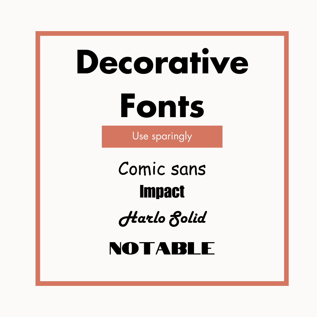
While attractive, these fonts often lack the clarity required for healthcare communication and might be more suitable for wellness brands aiming for a personal, boutique feel. In my marketing materials, I sometimes use a script font called “Amsterdam One” to because I like the retro look. Here are a few popular examples of other decorative fonts:
Comic Sans MS: Designed to mimic comic book lettering, it has a casual and informal feel, though it's often advised to use it judiciously in professional settings. (fun podcast recorded by Adobe if you’re interested)
Impact: Known for its ultra-bold and condensed lettering, widely used for headings, posters, and memes.
Harlo Solid: Is supposed to harken back to the 1930s and is nice for creating a fun retro cursive look but it still is fairly readable.
Notable: Known for being a very bold choice, Notable is an uppercase font with a lot of character. It was initially created for the Notable Women project in partnership with Google.
Hopefully this helps you navigate your options. A lot of people ask about color while they make these design considerations and if you’d like a “primer” on that, check this blog article out, “Colors that connect: how to choose the right palette for your practice’s website and branding.”
Aligning fonts with your healthcare brand
Whether your brand is more clinical or holistic, your font choice should resonate with these characteristics, ensuring that your message is both visually and emotionally aligned with your audience.
The choice should ultimately mirror your brand's personality and tone of voice. We just wrote a blog on finding your brand voice if you’d like to start there, “Mastering brand voice in healthcare marketing.”
Fonts for wellness brands often lean towards more organic and approachable styles, reflecting the nurturing aspect of wellness services.
Always think about how your font choice will be perceived by your target demographic. Fonts that resonate with your brand's identity can enhance your message's effectiveness and memorability.
Combining fonts for aesthetic appeal
Mixing different types of fonts can significantly enhance the visual appeal and effectiveness of your marketing materials, especially when done with a strategic understanding of their use in various contexts.
The art of font pairing
Combining a serif with a sans-serif font is a classic and effective approach. For example, using a serif font for titles or headers and a sans-serif font for body text can create a balanced and visually engaging layout. This pairing works well because the distinct styles draw attention to key areas (like titles or headers) while ensuring readability in longer sections (like body text). Adobe wrote a great article on font pairing and if you’d like to try it for yourself I really like the Monotype tool (and it’s free).
Logo fonts
The font used in a logo should encapsulate the essence of your brand. A decorative or script font might suit brands with a more personal, boutique feel, such as wellness spas or boutique clinics. For more corporate healthcare settings, a strong, clean sans-serif or a refined serif can communicate professionalism and trust. We wrote a blog on logo design if you’d like to check it out, “Design a logo that will make your holistic practice shine!”
Mastering the blend: try out different weights on titles and subtitles for impactful healthcare communication.
Titles and subtitles
Titles benefit from bolder, more striking fonts that capture attention. Serif fonts can convey authority and tradition, while sans-serifs offer a modern and clean look. Subtitles should complement the title but be slightly less prominent, perhaps using a lighter or more subdued style of the same font family.
Headers and subheaders
For headers, choose a font that stands out but remains cohesive with the overall design. This could be a bolder version of the body text font or a different font that matches the brand's identity. Subheaders should be distinct from headers but more subtle, acting as a bridge to the body text.
Body copy
Readability is paramount for body text fonts. Sans-serif fonts are often preferred for digital media due to their clarity and straightforward appearance. In print, serif fonts are commonly used as they are thought to help guide the eye along lines of text.
Practical considerations in typography selection
Readability on various platforms
Ensure that your chosen fonts perform well across different media, from print to digital platforms, maintaining legibility and consistency. Sometimes, it helps to actually print the materials out periodically while you’re designing them just to make sure they look the way you want. I have many times found something to look “perfect” on my computer screen, only to catch problems with it once it went to print.
Licensing and legality
Always use fonts that are appropriately licensed for commercial use to avoid legal issues and maintain professional integrity. You should be okay as long as you’re using standard fonts inside normal editing/content creation software (such as Microsoft Word, Google Docs, Canva, etc) but if you’re on random websites to download speciality fonts, just make sure you’re following legal and ethical guidelines. If you’d like to know more, Creative Bloq provided a solid overview.
Emerging trends and innovations in typography
If this has piqued your interest, I’d say there’s no harm in staying up to date with evolving trends in font design, such as the increasing use of variable fonts, which offer great versatility and can be a game-changer for digital healthcare platforms.
Conclusion: Choosing the right fonts for effective healthcare marketing
In healthcare marketing, the fonts we select carry more weight than we often realize. From the traditional reliability of serif fonts in printed brochures to the clean, modern appeal of sans-serif fonts on therapy websites or wellness platforms, each typeface plays a distinct role in shaping our brand's narrative.
It’s safe to say the best fonts for healthcare are those that not only resonate with the essence of your brand but also cater to the needs and expectations of your audience. Whether you're designing a healthcare website or crafting a brand identity for a wellness business, your font choices should facilitate a connection with your audience, ensuring that your message is both seen and felt.
Carefully align your typography with your brand's values and goals, you can create powerful, lasting impressions in the minds of your clients and patients. So, take the time to choose wisely, and watch as the right fonts transform your healthcare marketing into a more impactful and engaging experience.
Happy typing!


